Almost a decade ago, with memories of relatively recently departed Jordan fresh in my memory, my parents asked if I had any interest in going to Morocco. My old boss at Entity Green, Aaron, had done Peace Corps in Morocco before working with Philip and Wajih, and I’d heard many (mostly) pleasant stories about the country’s mix of Arab, Spanish, French, and Berber culture. There was a small Moroccan restaurant on the west side of Madison whose owner made annual trips to his home country to restock his spices and replace any ceramic dishware that had broken in the past year, and he often gave guided tours at the same time. We attended an informal ‘trip planning’ meeting with him to talk about potential itineraries, but a year later, I heard (via my parents) that the restaurant had closed, and no further progress was really made on any Morocco trip plans.
Over the years that followed, my parents developed an annual, sometimes even biannual hobby of international travel with my mother’s sister in law, my Aunt Betsy. While all three of them had traveled quite a bit throughout Europe and the USA, my parents’ visit to Jordan to see me in 2009 had awakened a hunger to see less touristed parts of the world, and Betsy was eager to do the same with some travel companions.
Every year since then, I’d hear about their trip to Tanzania, or Vietnam, or Cuba, or Croatia, or some other interesting area, and feel a little jealous that Christine and I couldn’t go with them. Unfortunately most of their travel would happen in the spring or the fall, exactly when Christine and her teaching schedule absolutely wouldn’t allow her to go anywhere.
But Morocco was always brought up, and I’d always (semi-jokingly) remind them that I was supposed to go with them on that trip, and we’d laugh, and they’d jet off somewhere else. But finally, as the effects of the pandemic started to wind down (at least for our demographic), my parents started talking about taking a big international trip again. And at long last, talks of Morocco turned from joking, to serious. And I said well, even if Christine can’t join me, I’d like to come along.
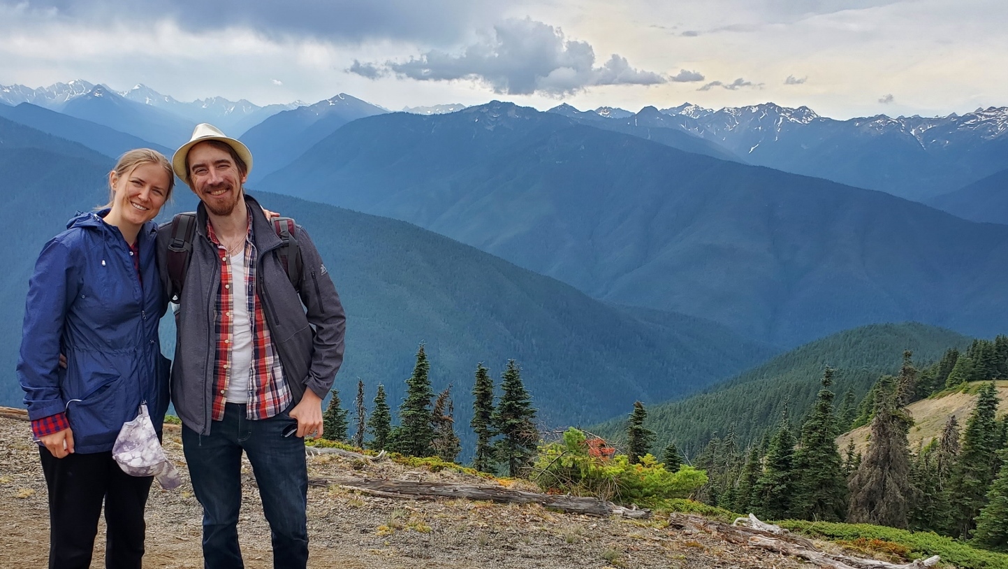
I never gave a second thought to what car to rent while traveling, or who to rent from. This past week’s trip to Portland, the Olympic National Park, and Seattle was no exception. We merely went on a price hunter website, found the lowest price for 7 days from a company we’d actually heard of before, and that was that. As usual, it was marketed as “Toyota Corolla or similar” – every rental company always seems to use the Corolla as their example. “Who hasn’t heard of a Corolla?” seems to be the unwritten assumption.
Of course, it’s very rarely a Corolla you’re actually given, particularly if your rental pickup is at an airport. It’s usually something cheaper – a Kia or Hyundai for instance. And Portland airport’s “Thrifty” car rental lived up to its name, handing me the keys to a 2021 Hyundai Sonata when we arrived at 12:30 in the morning this past Saturday. I thought nothing of it. I’d driven dozens of rental Hyundais, and despite sometimes feeling (and sounding) a bit like a riding lawn while climbing steep hills, they’d always been perfectly serviceable vehicles.
We picked up some tasty late-night Mexican on the way, got to our homestay by 2am, gobbled down our mole and burritos, and immediately passed out on the four-poster bed, excited to see Christine’s cousin and her family and begin our week of adventures in just a few short hours. Awaking at 8, I made coffee for the two of us and headed out to the car to warm up the engine (and cool down the air conditioning), which per the homestay host’s instructions, I’d parked on the quiet street in the quiet nondescript neighborhood, filled with large, somewhat dry trees (the Pacific Northwest is having a bit of a drought this year) and little ranch-style homes.
That’s odd, I thought to myself as I clicked the unlock button several times on the fob, walking toward the car. Maybe this one doesn’t beep or flash its lights when you unlock it. I got into the car, noticing a chunk of black plastic about the size of a quarter on the seat. I picked up, frowning at it. It looked like it had broken off something, and had the word “Kia” written on it – I had never bothered to look it up, but you’re probably not surprised to hear these two South Korean car companies, while independently operated, are both owned by Hyundai.
I was just starting to reach my hand out to put the key into the ignition when I realized that I could hear the outside traffic on the main Avenue, about 200 feet away, much more loudly than I should. That’s odd, I thought to myself yet again – did I leave the window open a crack last night? Poor, naive Zach. I finally turned around.
Will he survive the flight or will his lung explode? Find out… in tonight’s episode.
Please note I’m not a doctor, nor do I play one on television. I’m just related to several of them, even though they’d rather be neutering cats than dealing with fickle, litigation-prone humans. That being said, this post is solely my personal experience and probably wasn’t a good idea in the first place.
At long last, it seems that the sun of post-pandemic life has broken through the hazy greenish clouds of COVID-19. Christine, laid up now for almost a year with chronic back and neck pain with a side of tinnitus since our wedding party and Türkiye trip last June, was feeling cautiously optimistic about being on airplane seats again, and our good friends Branden and Caitlin were also looking to travel. The two of them had never been to Mexico before, so with the additional of our friend Dan, we made a five-some plan to travel to Tulum, just a few hours south of Cancun where Christine and I had last been in December 2021, right after our wedding.
Everything seemed like it would be in good order until, a mere week before we were supposed to fly out of Chicago on March 20th – my left lung collapsed. Again. For the third time in four months. Christine and I had both (finally) had our first and hopefully only coronavirus cases in November 2022 and I was suspicious that lingering viral whatsits in my body were causing this new and frequent resurgent of collapses. Over the past decade of living with chronic pneumothorax, I’ve become accustomed to about one collapse a year. This was an irritating new pattern starting to emerge.
Not that my collapses are what I (at this point in my life) would call “a big deal.” A dull, mild ache in my back when I lie in certain positions, slightly shortness of breath. I’ve never been diagnosed with a total collapse, either, they’ve always just be in the 15-20% range. And ol’ righty has always been fine, carrying the load for his weaker partner. But all pneumothorax sufferers know that you’re not supposed to fly with a collapsed lung. It’s basically the first thing they tell you (that, and no SCUBA diving) when you join this happy, breathless club. (It’s brought up quite a bit on our subreddit.) How was I going to go to Mexico with my four fellows next week?
Well, I’ve got my trump card, I thought (triumphantly) to myself. I’ll just check myself into the hospital, get put on a pure oxygen nasal cannula overnight, the osmotic pressure of the heavier atmospheric air (nitrogen, carbon dioxide, and oxygen) vs the lighter oxygen in my lungs will cause the air outside my lungs, to get pulled back in, and I’ll be totally cured in a matter of days, and certainly by the 20th. Off to the doctor I go to get a referral!
….Except, the last time I had done this little fast-heal trick had been pre-pandemic. You might have heard there’s a slight oxygen shortage going on worldwide. My doctors apologetically reminded me of this and said that basically you needed to be having serious medical complications in order to be granted oxygen in this day and age. Well, nuts. Even three days after the collapse, I could tell I was on the mend – it was getting less awkward to sleep on my back each night.
At this point, my insurance and I (mostly I) were paying for new x-rays of my chest every couple of days. Finally, on the 20th itself, I had a meeting with a thoracic surgeon to discuss possibly redoing the pleurodesis surgery procedure I had gone through a decade earlier. The surgeon was sympathetic, and we had a good hour long discussion about why he didn’t have high-hopes for a second, similar surgery. It turns out that when your lung tissue is more-or-less glued onto the inside of your chest wall, which is how further pneumothoraxes are prevented, it’s kind of the surgical equivalent of collapsing the entrywide behind you. All of the post-pleurodesis collapses had all been, after all, near the top part of my lung, not my side – which is where the typical entry points for the procedure are (entering from the shoulder is far more complicated because of the greater number of nerves, tendons, and other stuff up there). For all we knew, the “glue” of the previous surgery was still holding strong in my side. If he were to go in again, the process of entering my chest cavity might badly damage my lungs. Not guaranteed, but it would certainly be more risky than the first time.
“So, doc, about flying – of course everyone knows we collapsey types aren’t supposed to fly when we’re having an episode – what’s the worst case scenario?”
He said that the worst case that could happen is that since airplanes are pressurized, and the atmospheric air “bubble” that is trapped in the pleural space between your lungs, and your chest wall, is not able to equalize with the lowered air pressure of the cabin that’s inside your lungs, it could start to swell in your chest, press against your heart, and cause a cardiac arrest situation while you’re on the airplane. That’s about the worst direct occurrence for flying in this condition.
“What if,” I said carefully, “I were to go on an airplane now, with my lung collapse percentage down to just 3-5% and I’m almost healed?”
Ah yes, he said, glancing at his notes. Your primary care provider did mention you had a vacation in Mexico coming up. Well… I won’t speak against official medical guidelines. You’re not supposed to travel with a pneumothorax, of any size, for at least a few days after an x-ray shows it has closed. However, that being said, based on your history of having these collapses, the small percentage it has left to close, and your general overall good health besides this condition, I do think that the likelihood of anything happening like I described… is very low.
“Good enough for me!” I thought.
By the time I was actually in the car with Christine, ten minutes away from the parking lot where we’d be catching the Chicago metro to the airport, though, I wasn’t feeling so confident. I popped a half xanax (and had Christine drive) and drifted peacefully through security. On the plane itself, I put on an inexpensive pulse oximeter I’d purchased a few days ago for the trip, and put it on my index finger briefly to get a baseline reading. 97%, not bad at all.
The plane took off. I squeezed Christine’s hand tightly, and she squeezed back.
With our wonderful wedding reception last weekend now in our rear-view mirror, Christine and I now turn our sights to some fun over in Western Asia, in the lovely resort town of Bodrum in Türkiye along the northeastern coast of the Mediterranean Sea. Her high school friend, Damla, is Turkish and lives with her family in the capitol city of Ankara, which Christine has visited a few times. The stars aligned this year though, as Damla and her family invited us to join them in their annual summer holiday in Bodrum.
The last time I was in Türkiye was in 2015, when the “Camel Family” consisting of my friends Branden, Caitlin, and Kate had a couple nights of layover in Istanbul on our way to Jordan. Beyond reserving an AirBnB for a couple nights, we didn’t even put any thought into that stop in our journey – we took for granted that we’d get a cheap visa at the airport (Visa on Arrival, or VOA) and be in and out without any fuss. It’s difficult to remember exactly but I think the visa was $30 per person.
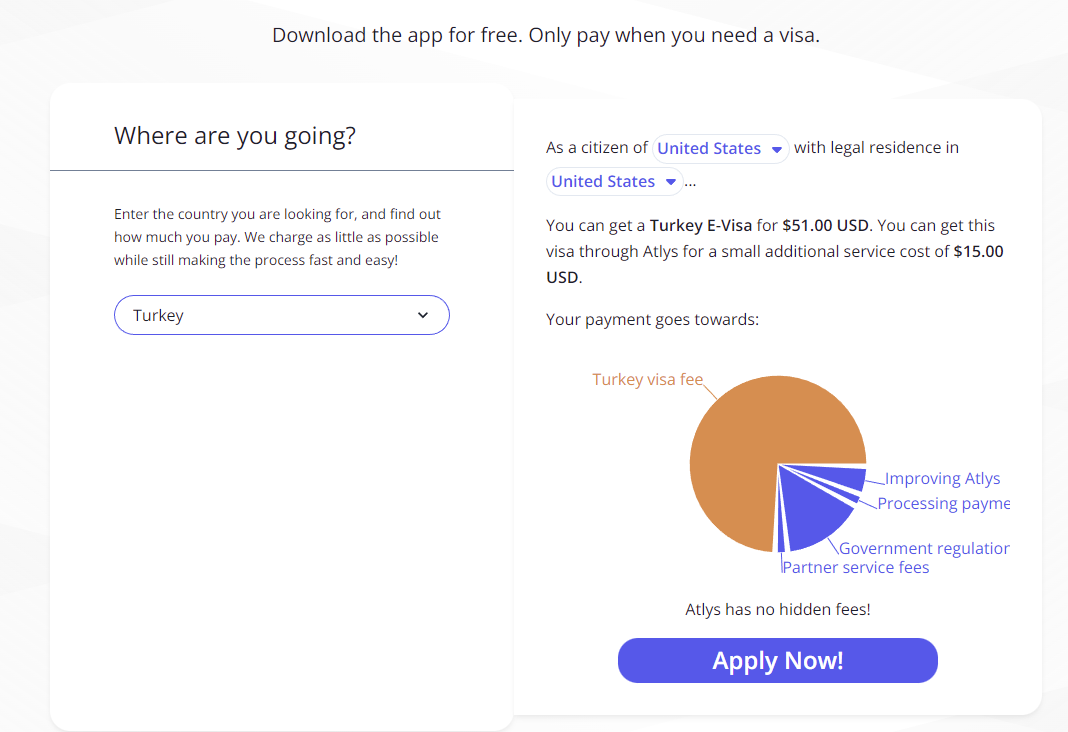
That was seven years ago. As Christine was doing research on our trip last week, she told me that we’d “better get our e-Visas ahead of time, and it looks like people on the internet are saying it’s not an easy process.” Besides having laughably out-of-date information (the official Turkish FAQ website on e-Visas quotes prices from 2014 in the form of a downloadable PDF – who is running their I.T. department???) we repeatedly had issues even getting the site to load in several browsers.
I finally had some luck getting the site to function long enough to input all the relevant information, receive the confirmation email with a link to the payment site and… that’s when the real trouble started. Every credit card we had, we tried putting into the payment site, the little “attempting to process payment” window showed up, but within a minute, it would error out with one word: “Sorry” appearing on the screen. Verbose error messages from a government e-Visa website? Of course not, don’t be silly.
Immediately, of course, we started doing web searches for any way around this problem. Almost like it was waiting for us to search for the phrase “turkish evisa payment not working”, we got a link to this company’s blog post, Atlys.com, which has a totally real and not at all paid-off sounding writer saying how he and his wife were frustrated with the same problem as us, but in the end, Atlys.com was the “easy way” to get their Turkish visas.
Of course, the totally real author, “Andrew” doesn’t mention that Atlys will, of course, charge you a service fee of $15 per visa for their part. So, if
paying a service fee that equates to almost an extra third of the cost of the visa itself
needing to make another account, and being forced to install a smartphone app just to get a visa rather than using a desktop website
doesn’t leave a bad taste in your mouth, then read no further – I’m sure Atlys would love to have your money!
But I’m an I.T. guy. Both of those bullet points left me nonplussed. We fix problems, and we try to do it as cheaply as possible. (it keeps the bosses happy when we save them money, after all!). So what’s a “free” way (i.e. – no service fees. You’ll still have to pay for your actual visas themselves, of course) to deal with this e-Visa website?
Our wedding last November was planned and carried out in such a whirlwind, about five weeks of planning, that comparatively speaking, giving ourselves six months to organize last weekend’s reception felt almost like overkill. But then we remembered that our wedding only hosted 20 people, and this reception was being thrown for almost a hundred, and we felt very thankful that we had given ourselves so much time.
In the end, everything came together perfectly, especially thanks to our parents, and friends Blair & Aurelia, who stayed at the condo with us the day beforehand to help with last-minute decorating decisions and providing transport to boxes upon boxes of said decorations to Tenney Park here in Madison, where we had reserved its beautiful pavilion all the way back last December. Camel siblings Branden & Caitlin provided some excellent wine, which was perfectly paired to the three types of picnic-style sandwiches that we selected from Gaylord Catering.
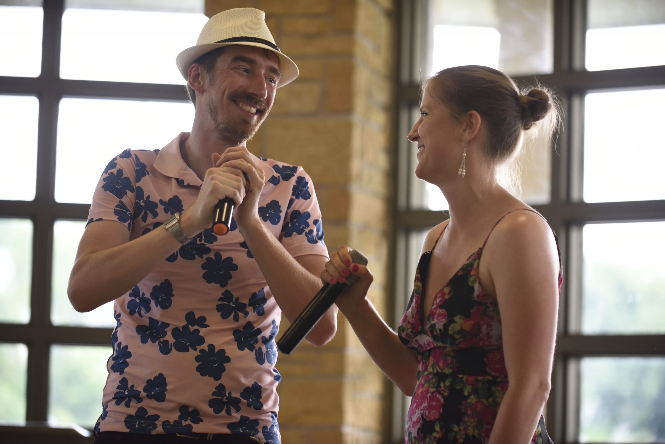
Christine & I had joked about this for years, half-seriously, about doing the Austin Powers dance (mostly based off of the intro to Austin Powers 3) but about two months ago, entirely in secret, we started choreographing and designing a dance to do at the reception. We decided on our moves solely off of looking up what other people had put on the internet, discarding 80% of what we found as “not suitable for people as old and stiff-jointed as we are” and melding the rest into a silly 1.5 minute dance. We figured the other half of the song could have the rest of our guests join us – and they did!
Without further ado, here we are, dancing up a storm. Remember, despite my ~4 years in show choir(s) more than a decade ago, neither of us have any real dance experience, and definitely not any experience choreographing dances! In the middle of it, you might notice our simple “salsa dance” step in there, as an homage to our year in Panama back in 2017-2018.
Video credit to Jonathan Heise & Forrest Herr
About an hour later (plenty of time for me to lose my voice due to happy, and perhaps-too-much-wine-drinking, excitement) Christine pulled out our second prepared duo act – one of her favorite songs, L-O-V-E by Nat King Cole, except to work with our vocal range, she found an arrangement by Nat’s daughter, Natalie Cole, and gave that to our DJ, Tony Cenite. (Great guy, by the way – he didn’t have a lot of reviews online, but we took a chance on him and we’re glad we did) Here it is below! Sure our voices aren’t in the best singing shape, but it was still a lot of fun.
Video credit to Jonathan Heise and Andre Wehrle
The following morning, we also hosted a tour of the nearby Olbrich Botanical Gardens for about a dozen of our family & friends, followed by a hosted brunch at the Breakwater restaurant, over down by where Lake Monona flows into the Yahara river and continues on its journey to the next lake in the watershed. It was great to see so many people, and with some sadness that there were a few people who we really wanted to attend, that couldn’t make it for pandemic-related reasons, it was almost like we hadn’t needed to spend the past two years in CoViD hibernation. Christine & I have been extremely lucky to not have lost any close relatives to the virus – even her 94 year old grandmother!
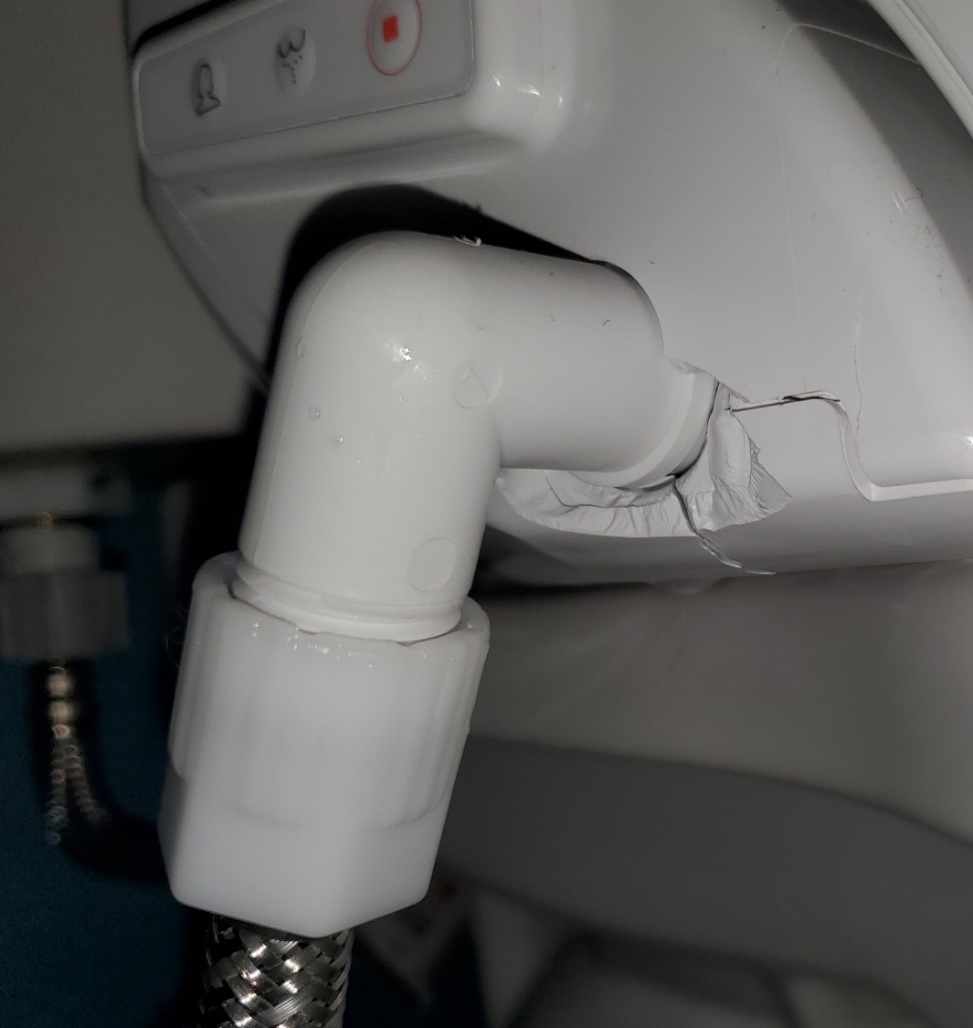
It’s…probably not supposed to do that.
The one bad piece of luck for the weekend at least turned out to be slightly amusing. Sunday morning, about 10 minutes before Christine & I were to drive off to Olbrich, I had just been commenting on how well Saturday’s reception had gone to my parents in law. They teased me about saying something like that, and I snorted that I didn’t believe in luck. Moments later, Christine calls from the bathroom “oh no! oh god! what’s going on?!” I rushed in to see water spraying from our beloved washlet, that we bought and installed just days before the pandemic, and pooling on the floor. I rushed to the shutoff valve on the wall and turned it off, but not before at least a couple gallons had made it onto the floor. The downstairs neighbor appeared a few minutes later, politely but seriously concerned that water was pouring out of her ceiling vent fan in her bathroom, right below ours. In the end, it could have been far worse – it looked like the pressure in the washlet’s water tank had caused a bit of the plastic casing to explode off when Christine pressed the ‘wash’ button. I just had to laugh (wryly) at the timing of the explosion just as I said I didn’t believe in luck.
Technical note, ignore if you don’t care about tech stuff: These two videos are using a new open-source, royalty-free codec called AV1 that I’m pretty excited about. They should play back in pretty much every browser, except Apple’s Safari. (Get with the times please, Apple) I encoded a separate, slightly-lower quality version of each video and embedded it in such a way that it should only load the lower-quality file if it detects an iPad, iPhone, or the Safari mac browser. To watch the superior file, use any other browser. Please let me know if you have any feedback or issues.
Update 2024-01-06 – I just realized that the beloved AV1 codec I was crowing about a year and a half ago, wasn’t playing properly in any browser! Why was that? Well, I did a bit of looking into things, and found that when I originally posted the code to “dual-stack” both New-AV1 (for good browsers) and Old-H264 (for Apple browsers), I completely forgot to add the various codec parameters needed for AV1 (at least in this day and age). What I had posted was merely "codecs=av01,mp4a.40.2" but what I needed to post, and if you View Source on this post you’ll see it, was "codecs=av01.0.08M.08,mp4a.40.2" The parts separated by periods/dots are the codec parameters, and the parts separated by commas are the Video stream, and then the Audio stream. After fixing that using ffmpeg to scrape the metadata out of the .mp4 AV1 files and then appending that onto the source link… now glorious AV1 should be playing on your browser by default, provided it’s a browser that supports AV1 and you have the codec installed on your computer. Whew! That is annoying though, to dig through an ffmpeg output to find the 4 mandatory parameters required to make DASH (streaming) AV1 streaming work, when H264 doesn’t need that. Hopefully in the future browsers will detect that automatically; AV1 is still pretty new now.
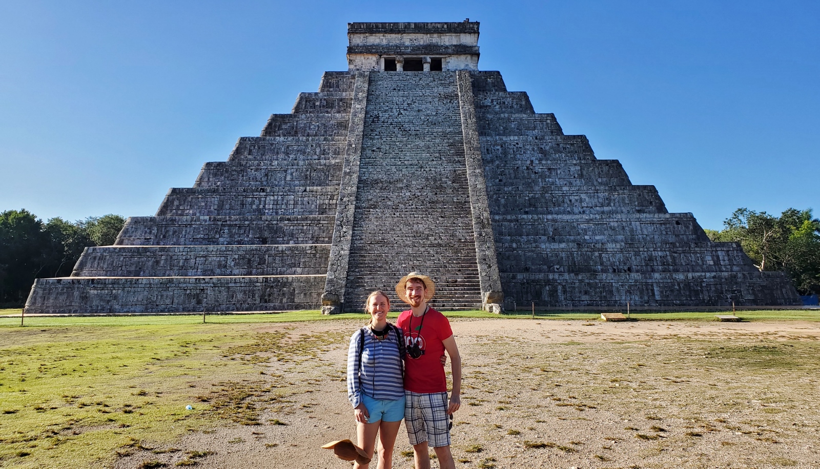
Chichen Itza with no other tourists in it (yet)? Just get up at 5 in the morning!
Another excuse to go to Mexico! Christine and I have been several times before, but this is the first time we’ve had a honeymoon. Over the past several months we’d been looking around for places to travel to while she had her Christmas break, but thanks to COVID, Mexico was an easy thing to settle on – namely due to the low prices (we got tickets for $187 apiece round trip) and the lack of a mandatory 14-day quarantine. We want to go visit my foreign exchange sister Farah in South Korea, but the quarantine they require pretty much kills any chance of a trip for pleasure. Which to be honest, is probably as it should be during a global pandemic.
While Christine had been to the Yucatan peninsula twice before, this was my first visit. While the temperature hasn’t been too bad in Wisconsin thus far, it was still nice to get to tropical climates. After arriving at the Cancun airport, we had initially planned to take the 5 dollar (approximately) “ADO” branded bus from the airport past the “Zona Hotelera,” the huge North-South running strip of gorgeous beach running along the eastern coast of the Mexican state of Quintana Roo, to get to Central Cancun, where we had our first night’s hotel before heading on to the Yucatan State Capitol of Merida. However, despite the bus company’s website stating that buses would run until 11:45 at night and us stepping out into the humid air at 11pm, the taxi drivers were more than happy to inform us that the buses had stopped for the evening, and “you are at our mercy” was not stated, but subtly implied.
At 1AM in Cancun, you can still find a good Mexican party with an idol to Mary
We knew the Mexican cartels control the transport system around Cancun (Uber and other ride-share systems simply do not exist in Cancun, like they do in other parts of Mexico, due to High Chances of Messy Decapitation) so we didn’t bother arguing too much. We took our “private” taxi for $15 per person up to Central, although the hustlers at the taxi center suddenly crammed another 3 backpacking young people into our cab (all English speakers from Europe, who told us they were also told they were getting a “private” taxi for $15 each) and necessitated several long waits in heavy traffic along the Hotel Zone.
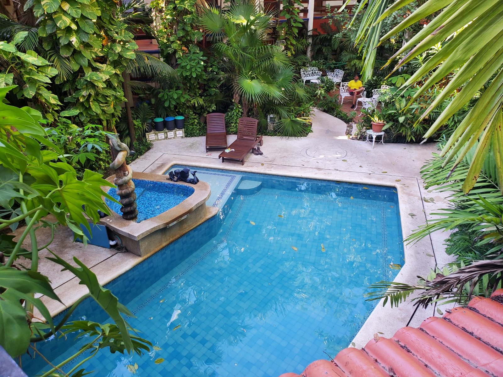
I love a good courtyard
Our first night’s stay was quiet and relaxing in an “eco-hotel” – a refreshing return to one of my favorite aspects of Mexican and Spanish (and Arabic, let’s be honest – thanks Moors!) architecture, the unassuming front of the building hiding a gorgeously appointed interior courtyard with fountains and gardens everywhere. A quick foot-dip in the pool and breakfast, and we were on to the central bus station of Cancun (we had chosen the hotel because it was a 5 minute walk to the bus station) and a 3 hour ride to Merida.
Our hotel in Merida was called the Mission of Friar Diego. I had never heard of this Spanish fellow, but the stately convent-converted-to-hotel had lots of helpful plaques, artwork, statues, and signs to give some history. Apparently several hundred years ago he performed an “act of faith” for the Mayan people, by helpfully burning thousands of religious books and objects to better focus their attention on his god. He was later granted the Bishopric of the region by the Spanish crown for this action. Fast forward to now, and I’m not entirely sure how the hotel’s owners were presenting this guy; as neutrally as possible, it seemed. The room was nice though; having 2 foot thick stone walls really kept the place comfortably cool and quiet.
Some say they’re still on the original candles.
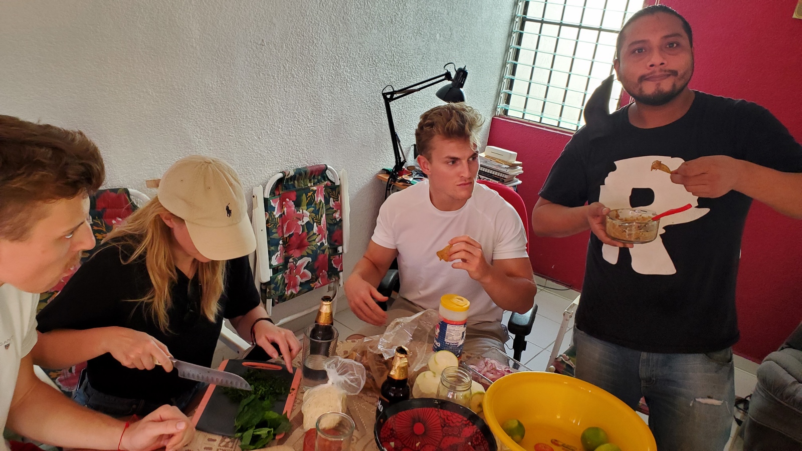
For our first day in Merida, a young Mestizo (Mayan/Spanish descended) man named Gus gave us a cooking class. We were joined a quartet of 20-something Germans, two brothers and their girlfriends on vacation. Gus freely admitted to us that this was his first time leading his class again in a year and a half since the pandemic began. He and his elderly aunt had run it out of her home for several years, but due to her advanced age he didn’t want to risk her health with guests, so we’d instead be using his friend Joachim’s kitchen.
Our previous Mexican cooking class experience in Oaxaca several years ago had begun in the local market, and Gus’s class was the same: the bustling central market does indeed seem to be a hallmark of Mexican culture. Throughout our time in Mexico, people did a great job of keeping their masks on, even outside in public – from what we could tell it was until recently mandated to wear masks even while outside, but that had been relaxed somewhat. 18 month habits die hard though, and it seemed 60-80% of people kept up the practice. Inside in the market, it was closer to 95-99% – which was good, because the aisles were tightly packed.
I’ve seen places like this in dozens of countries over the years but never in the USA. Perhaps an FDA/USDA safety issue?
We saw lots of fresh hot sauce for sale, and surprising numbers of radishes. Proprietary and exotic blends of red, black, green, and brown spices, mixed with oil and water to make it a sticky and grainy paste, were sold in plastic bags. Most interesting to me was a rickety, almost steam-punk looking corn tortilla making machine in one stall – its owners would feed in the stone-ground cornmeal dough into a chute on the top, where it’d be flattened and exuded into a thin sheet on a drum underneath, where two disc blades sliced the sheet every 6 inches into two neat circles and recycled the excess back into the drum. The twin baby tortillas would drop onto a semi-circular grated conveyor belt which was precisely long enough to run the sets of twins under a long upper and lower burner, perfectly toasting them by the time they reached the end where the staff would scoop them up by the handful and place them directly into consumers’ waiting hands. The price was 20 pesos per kilo, which equals a little less than a dollar. And a kilo of small corn tortillas looked like about 60-80 – so yeah, people here eat a lot of tortillas!
Thanks to the pandemic, the government has set laws on the number of people that can be in taxis and rideshares – and no one can ride in the front seat next to the driver. So our group of 7 had to be split into three Ubers (no cartels here to stop the rideshare industry; Merida is known for being a relatively safe community in the peninsula) which Gus paid for in cash. The 20 minute ride across town cost the equivalent of about 2 USD.
We met Joachim at his home and beers were cracked open all around as we began to cook. One of the young German couples worked in the kitchen of a boutique hotel near the Baltic sea and industriously began perfectly dicing the tomatoes and onions exactly to Gus’s specifications. We made our own tortillas from masa corn flour Gus had on hand (we didn’t grind the kernels ourselves though!) in an aluminum die-cast mold. For some of the tortillas, we mixed in the finely diced leaves of a local Mayan herb, Chaya, into the dough before molding.